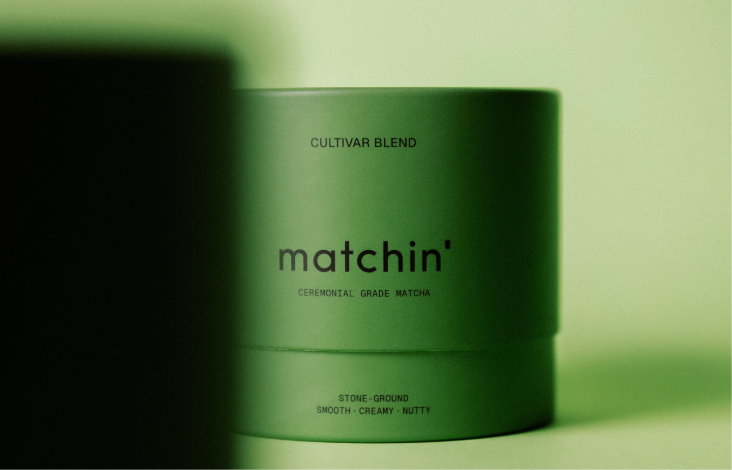
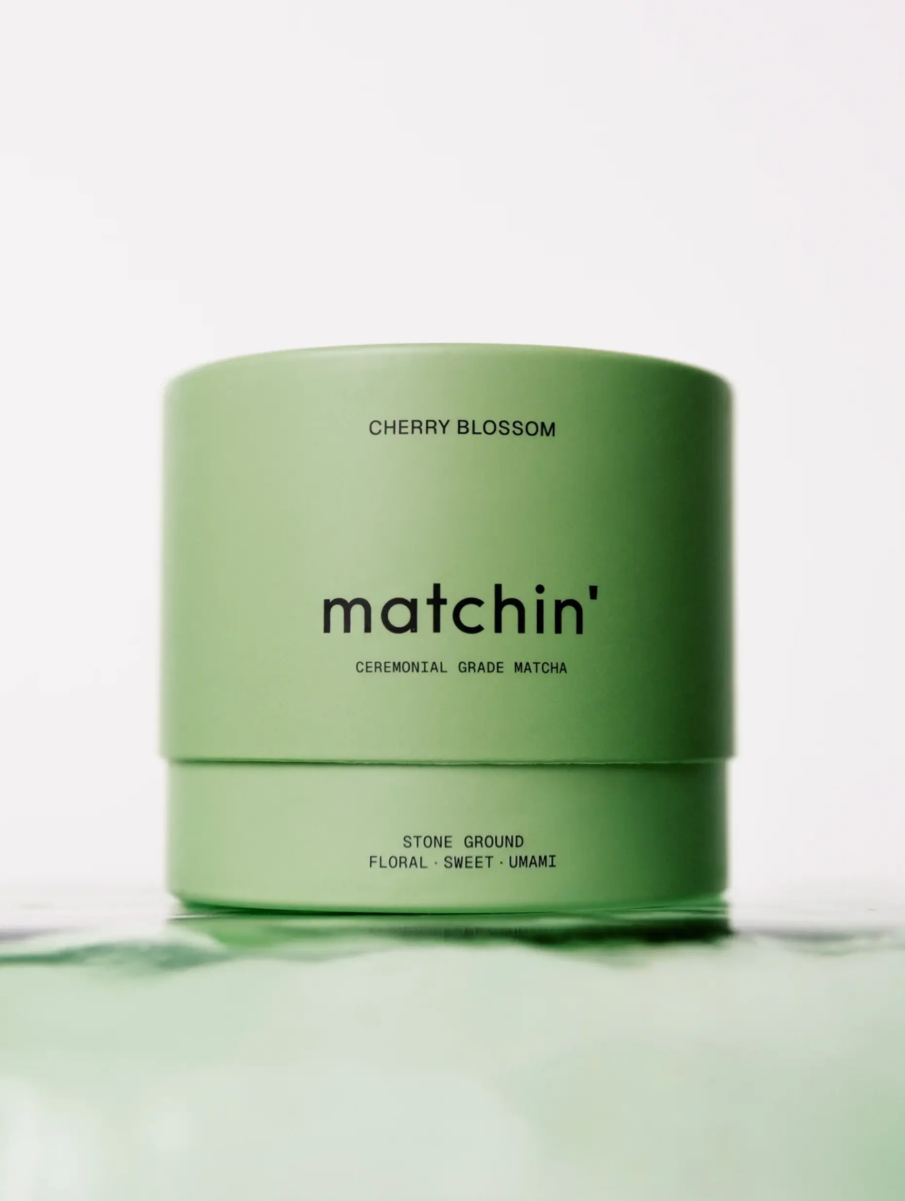
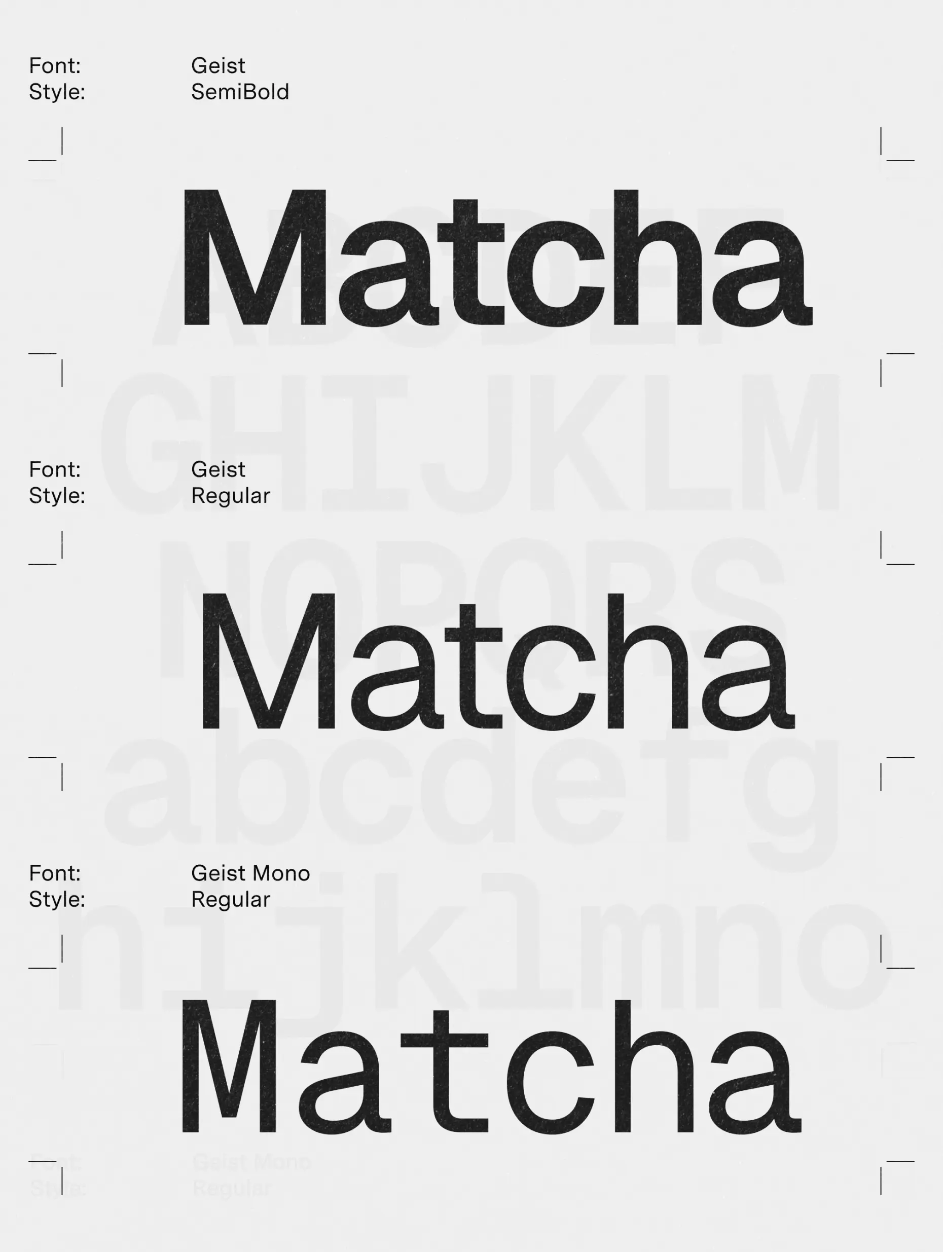
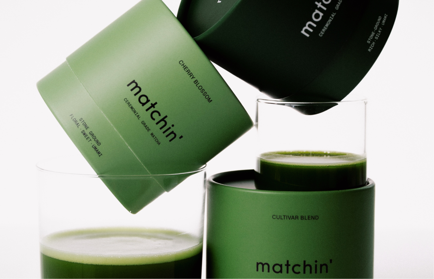
We guided Matchin’ from initial sketches to the final product, translating the concept of a daily ritual into a clear visual language. Our work included full branding, visual identity, and thoughtful packaging design. A geometric apostrophe in the logo and a minimalist typeface introduced lightness and modernity. Muted colors and subtle accents support a sense of calm and clarity. The packaging reflects the brand’s narrative and emotional dimension, creating a cohesive system that draws attention and strengthens brand recognition. Every element works together to create an authentic space for daily mindfulness and elevate the user experience while reinforcing Matchin’ as a contemporary lifestyle brand.
We guided Matchin’ from initial sketches to the final product, translating the concept of a daily ritual into a clear visual language. Our work included full branding, visual identity, and thoughtful packaging design. A geometric apostrophe in the logo and a minimalist typeface introduced lightness and modernity. Muted colors and subtle accents support a sense of calm and clarity. The packaging reflects the brand’s narrative and emotional dimension, creating a cohesive system that draws attention and strengthens brand recognition. Every element works together to create an authentic space for daily mindfulness and elevate the user experience while reinforcing Matchin’ as a contemporary lifestyle brand.